AutoGrid compoment for input form
UPDATED 12/06/2023
Many time we need a input form set in grid
however it’s unpleasant to set for each control in grid the Grid.Row and Grid.Colum when we change one or more definitions (insert or remove children)
the AutoGrid Control is made for simplify this
|
1 2 3 4 5 6 7 8 9 10 11 12 13 14 15 16 17 18 19 20 21 22 23 24 25 26 27 28 29 30 31 32 33 34 35 36 37 38 39 40 41 42 43 44 45 46 47 48 49 50 51 52 53 54 55 56 57 58 59 60 61 62 63 64 65 66 67 68 69 70 71 72 73 74 75 76 77 78 79 80 81 82 83 84 85 86 87 88 89 90 91 92 93 94 95 96 97 98 99 100 101 102 103 104 105 106 107 108 109 110 111 112 113 114 115 116 117 118 119 120 121 122 123 124 125 126 127 128 129 130 131 |
public class AutoGrid : Grid { #region Constructor protected bool firstInit { get; private set; } = false; public AutoGrid() => this.Loaded += (ss, ee) => { firstInit = true; Update(); }; #endregion #region DP #region ColumnsStringDefinition (DP SHORT) public string ColumnsStringDefinition { get { return (string)GetValue(ColumnsStringDefinitionProperty); } set { SetValue(ColumnsStringDefinitionProperty, value); } } public static readonly DependencyProperty ColumnsStringDefinitionProperty = DependencyProperty.Register("ColumnsStringDefinition", typeof(string), typeof(AutoGrid), new PropertyMetadata(null, (ss, ee) => (ss as AutoGrid)?.Update())); #endregion #region RowsStringDefinition (DP SHORT) public string RowsStringDefinition { get { return (string)GetValue(RowsStringDefinitionProperty); } set { SetValue(RowsStringDefinitionProperty, value); } } public static readonly DependencyProperty RowsStringDefinitionProperty = DependencyProperty.Register("RowsStringDefinition", typeof(string), typeof(AutoGrid), new PropertyMetadata(null, (ss, ee) => (ss as AutoGrid)?.Update())); #endregion #region UseColumnSeparator (DP SHORT) public bool UseColumnSeparator { get { return (bool)GetValue(UseColumnSeparatorProperty); } set { SetValue(UseColumnSeparatorProperty, value); } } public static readonly DependencyProperty UseColumnSeparatorProperty = DependencyProperty.Register("UseColumnSeparator", typeof(bool), typeof(AutoGrid), new PropertyMetadata(true, (ss, ee) => (ss as AutoGrid)?.Update())); #endregion #region ColumnSeparatorSize (DP SHORT) public double ColumnSeparatorSize { get { return (double)GetValue(ColumnSeparatorSizeProperty); } set { SetValue(ColumnSeparatorSizeProperty, value); } } public static readonly DependencyProperty ColumnSeparatorSizeProperty = DependencyProperty.Register("ColumnSeparatorSize", typeof(double), typeof(AutoGrid), new PropertyMetadata(4.0, (ss, ee) => (ss as AutoGrid)?.Update())); #endregion #region InsideColumSeparator (DP SHORT) public bool InsideColumSeparator { get { return (bool)GetValue(InsideColumSeparatorProperty); } set { SetValue(InsideColumSeparatorProperty, value); } } public static readonly DependencyProperty InsideColumSeparatorProperty = DependencyProperty.Register("InsideColumSeparator", typeof(bool), typeof(AutoGrid), new PropertyMetadata(false, (ss, ee) => (ss as AutoGrid)?.Update())); #endregion #endregion protected override void OnVisualChildrenChanged(DependencyObject visualAdded, DependencyObject visualRemoved) { base.OnVisualChildrenChanged(visualAdded, visualRemoved); Update(); } protected int MaxColumn { get; private set; } protected virtual void Update() { if (!firstInit) return; if (ColumnsStringDefinition != null) { #region set columns definitions this.ColumnDefinitions.Clear(); string[] cols = ColumnsStringDefinition.Split('|'); { foreach (string col in cols) { if (col.ToLower().Equals("auto")) this.ColumnDefinitions.Add(new ColumnDefinition() { Width = GridLength.Auto }); else if (col.Equals("*")) this.ColumnDefinitions.Add(new ColumnDefinition() { Width = new GridLength(1, GridUnitType.Star) }); else this.ColumnDefinitions.Add(new ColumnDefinition() { Width = new GridLength(double.Parse(col, CultureInfo.InvariantCulture)) }); if (UseColumnSeparator) { this.ColumnDefinitions.Add(new ColumnDefinition() { Width = new GridLength(ColumnSeparatorSize) }); } } } #endregion #region set rows definitions List<RowDefinition> rs = new List<RowDefinition>(); this.RowDefinitions.Clear(); if (RowsStringDefinition == null) RowsStringDefinition = "auto|4"; { { string[] rows = RowsStringDefinition.Split('|'); foreach (var row in rows) { if (row.ToLower().Equals("auto")) rs.Add(new RowDefinition() { Height = GridLength.Auto }); else if (row.Equals("*")) rs.Add(new RowDefinition() { Height = new GridLength(1, GridUnitType.Star) }); else rs.Add(new RowDefinition() { Height = new GridLength(double.Parse(row, CultureInfo.InvariantCulture)) }); } } } #endregion #region update row and col for childrens { int col = 0; int row = 0; MaxColumn = cols.Count() * (UseColumnSeparator ? 2 : 1); foreach (UIElement item in this.Children) { Debug.WriteLine($"nb cols {MaxColumn} col = {col} row = {row}"); // add new row il col = 0 if (col == 0) { // set rows definitions foreach (var rx in rs) { this.RowDefinitions.Add(rx.Clone()); } } // set item Grid.SetColumn(item, col); Grid.SetRow(item, row); if (UseColumnSeparator || InsideColumSeparator) col++; if (++col >= MaxColumn) { col = 0; row += rs.Count; } } } #endregion } } } |
and extensions
|
1 2 3 4 5 6 7 8 |
public static class DefintionsExtension { public static ColumnDefinition Clone(this ColumnDefinition col) => new ColumnDefinition() { Width = col.Width }; public static RowDefinition Clone(this RowDefinition row) => new RowDefinition() { Height = row.Height }; } |
and you must only set
| Property | Definition |
|---|---|
| ColumnsStringDefinition | Set columns do you want with (separator |) with Auto, *, double value if you use UseColumnSeparator = true, a separator is added after all columns with Size define in ColumnSeparatorSize if you use InsideColumSeparator = true mean that separator are define in ColumnsStringDefinition like this auto|4|auto|6|*, in this cas 4, 6 are separators size |
| UseColumnSeparator | default true indicate we have a step of one column Between two columns in ColumnsStringDefinition |
| InsideColumSeparator | default false indicate that the columns separator are define in ColumnsStringDefinition (for having differents size of serparators) like this auto|20|auto|10|* |
| RowsStringDefinition | Default row at auto otherwize insert for each definition of a row all rows define in this with auto,* and double value if you define row in two members separate by | like auto|2 it’s mean that row size is auto and a separator sized a 2 |
| ColumnSeparatorSize | Default separator size double 4.0 if UseColumnSeparator is set to true |
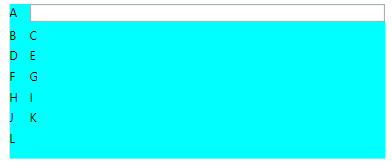
and in xaml
put the children in the order of appearance row then column
|
1 2 3 4 5 6 7 8 9 10 11 12 13 14 15 16 17 18 19 20 21 22 |
<local:AutoGrid ColumnsStringDefinition="auto|*" UseColumnSeparator="true" ColumnSeparatorValue="10.5" RowsStringDefinition="auto|4" Background="Aqua" Margin="195,19,230,0" Height="140" VerticalAlignment="Top"> <TextBlock Text="A" /> <TextBox /> <TextBlock Text="B" /> <TextBlock Text="C" /> <TextBlock Text="D" /> <TextBlock Text="E" /> <TextBlock Text="F" /> <TextBlock Text="G" /> <TextBlock Text="H" /> <TextBlock Text="I" /> <TextBlock Text="J" /> <TextBlock Text="K" /> <TextBlock Text="L" /> </local:AutoGrid> |
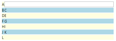
a new version Colored AutoGridColored with even and odd color for rows
|
1 2 3 4 5 6 7 8 9 10 11 12 13 14 15 16 17 18 19 20 21 22 23 24 25 26 27 28 29 30 31 32 33 34 35 36 37 38 39 40 41 42 43 44 45 46 47 48 49 50 51 52 53 54 55 56 57 58 59 60 61 62 |
public class AutoGridColored : AutoGrid { #region EvenRowColor (DP SHORT) public Brush EvenRowColor { get { return (Brush)GetValue(EvenRowColorProperty); } set { SetValue(EvenRowColorProperty, value); } } public static readonly DependencyProperty EvenRowColorProperty = DependencyProperty.Register("EvenRowColor", typeof(Brush), typeof(AutoGridColored), new PropertyMetadata(Brushes.Transparent, (ss, ee) => (ss as AutoGridColored)?.Update())); #endregion #region OddRowColor (DP SHORT) public Brush OddRowColor { get { return (Brush)GetValue(OddRowColorProperty); } set { SetValue(OddRowColorProperty, value); } } public static readonly DependencyProperty OddRowColorProperty = DependencyProperty.Register("OddRowColor", typeof(Brush), typeof(AutoGridColored), new PropertyMetadata(Brushes.Transparent, (ss, ee) => (ss as AutoGridColored)?.Update())); #endregion private bool onUpdate = false; protected override void Update() { if (!firstInit) return; if (onUpdate) return; onUpdate = true; // remove item added for color for (var i = 0; i < this.Children.Count;) { if (Children[i] is Rectangle rec && (rec.Tag?.Equals("backline") ?? false)) { Children.RemoveAt(i); } else i++; } base.Update(); bool even = true; if (EvenRowColor != Brushes.Transparent || OddRowColor != Brushes.Transparent) { if (RowsStringDefinition == null) RowsStringDefinition = "auto|4"; string[] rows = RowsStringDefinition.Split('|'); int dorow = 0; int row = 0; foreach (var item in RowDefinitions) { if(dorow == 0) { Rectangle rec = new Rectangle { Fill = even ? EvenRowColor : OddRowColor, Tag = "backline", }; even = !even; Grid.SetColumn(rec, 0); Grid.SetRow(rec, row); Grid.SetColumnSpan(rec, MaxColumn); this.Children.Insert(0, rec); } dorow = (++dorow % rows.Length); row++; } } onUpdate = false; } } |
usage
|
1 2 3 4 5 6 7 8 |
<local:AutoGridColored ColumnsStringDefinition="auto|*" UseColumnSeparator="false" RowsStringDefinition="auto|2" EvenRowColor="LightYellow" OddRowColor="LightBlue" Margin="195,196,230,0" Height="178" VerticalAlignment="Top"> |
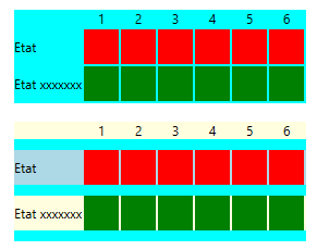
other samples
|
1 2 3 4 5 6 7 8 9 10 11 12 13 14 15 16 17 18 19 20 21 22 23 24 25 26 27 28 29 30 31 32 33 34 35 36 37 38 39 40 41 42 43 44 45 46 47 48 49 50 51 52 53 54 55 56 57 58 59 60 61 62 63 64 65 66 67 68 69 70 71 72 73 74 75 76 77 78 79 80 81 82 83 84 85 86 87 88 89 90 91 92 93 94 95 96 97 98 99 100 101 102 103 104 105 106 107 108 109 110 111 112 113 114 115 116 117 118 119 120 121 122 123 124 125 126 |
<uccontrol:AutoGrid Margin="285,187,0,0" Background="Aqua" ColumnsStringDefinition="auto|auto|auto|auto|auto|auto|auto" UseColumnSeparator="true" RowsStringDefinition="auto|2" ColumnSeparatorValue="2" VerticalAlignment="Top" HorizontalAlignment="Left"> <TextBlock /> <TextBlock Text="1" HorizontalAlignment="Center" /> <TextBlock Text="2" HorizontalAlignment="Center" /> <TextBlock Text="3" HorizontalAlignment="Center" /> <TextBlock Text="4" HorizontalAlignment="Center" /> <TextBlock Text="5" HorizontalAlignment="Center" /> <TextBlock Text="6" HorizontalAlignment="Center" /> <TextBlock Text="Etat" VerticalAlignment="center" /> <Rectangle Fill="red" Width="32" Height="32" /> <Rectangle Fill="red" Width="32" Height="32" /> <Rectangle Fill="red" Width="32" Height="32" /> <Rectangle Fill="red" Width="32" Height="32" /> <Rectangle Fill="red" Width="32" Height="32" /> <Rectangle Fill="red" Width="32" Height="32" /> <TextBlock Text="Etat xxxxxxx" VerticalAlignment="center" /> <Rectangle Fill="Green" Width="32" Height="32" /> <Rectangle Fill="Green" Width="32" Height="32" /> <Rectangle Fill="Green" Width="32" Height="32" /> <Rectangle Fill="Green" Width="32" Height="32" /> <Rectangle Fill="Green" Width="32" Height="32" /> <Rectangle Fill="Green" Width="32" Height="32" /> </uccontrol:AutoGrid> <uccontrol:AutoGridColored Margin="285,290,0,0" Background="Aqua" ColumnsStringDefinition="auto|auto|auto|auto|auto|auto|auto" UseColumnSeparator="true" RowsStringDefinition="auto|10" ColumnSeparatorValue="2" VerticalAlignment="Top" HorizontalAlignment="Left" EvenRowColor="LightYellow" OddRowColor="LightBlue"> <TextBlock /> <TextBlock Text="1" HorizontalAlignment="Center" /> <TextBlock Text="2" HorizontalAlignment="Center" /> <TextBlock Text="3" HorizontalAlignment="Center" /> <TextBlock Text="4" HorizontalAlignment="Center" /> <TextBlock Text="5" HorizontalAlignment="Center" /> <TextBlock Text="6" HorizontalAlignment="Center" /> <TextBlock Text="Etat" VerticalAlignment="center" /> <Rectangle Fill="red" Width="32" Height="32" /> <Rectangle Fill="red" Width="32" Height="32" /> <Rectangle Fill="red" Width="32" Height="32" /> <Rectangle Fill="red" Width="32" Height="32" /> <Rectangle Fill="red" Width="32" Height="32" /> <Rectangle Fill="red" Width="32" Height="32" /> <TextBlock Text="Etat xxxxxxx" VerticalAlignment="center" /> <Rectangle Fill="Green" Width="32" Height="32" /> <Rectangle Fill="Green" Width="32" Height="32" /> <Rectangle Fill="Green" Width="32" Height="32" /> <Rectangle Fill="Green" Width="32" Height="32" /> <Rectangle Fill="Green" Width="32" Height="32" /> <Rectangle Fill="Green" Width="32" Height="32" /> </uccontrol:AutoGridColored> |
for result
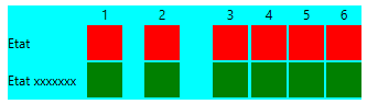
and sample with columns separator inside definition
|
1 2 3 4 5 6 7 8 9 10 11 12 13 14 15 16 17 18 19 20 21 22 23 24 25 26 27 28 29 30 31 32 33 34 35 36 37 38 39 40 41 42 43 44 45 46 47 48 49 50 51 52 53 54 55 56 57 58 59 60 61 62 63 |
<uccontrol:AutoGrid Margin="600,187,0,0" Background="Aqua" ColumnsStringDefinition="auto|10|auto|20|auto|30|auto|3|auto|2|auto|2|auto" UseColumnSeparator="false" InsideColumSeparator="true" RowsStringDefinition="auto|2" ColumnSeparatorSize="2" VerticalAlignment="Top" HorizontalAlignment="Left"> <TextBlock /> <TextBlock Text="1" HorizontalAlignment="Center" /> <TextBlock Text="2" HorizontalAlignment="Center" /> <TextBlock Text="3" HorizontalAlignment="Center" /> <TextBlock Text="4" HorizontalAlignment="Center" /> <TextBlock Text="5" HorizontalAlignment="Center" /> <TextBlock Text="6" HorizontalAlignment="Center" /> <TextBlock Text="Etat" VerticalAlignment="center" /> <Rectangle Fill="red" Width="32" Height="32" /> <Rectangle Fill="red" Width="32" Height="32" /> <Rectangle Fill="red" Width="32" Height="32" /> <Rectangle Fill="red" Width="32" Height="32" /> <Rectangle Fill="red" Width="32" Height="32" /> <Rectangle Fill="red" Width="32" Height="32" /> <TextBlock Text="Etat xxxxxxx" VerticalAlignment="center" /> <Rectangle Fill="Green" Width="32" Height="32" /> <Rectangle Fill="Green" Width="32" Height="32" /> <Rectangle Fill="Green" Width="32" Height="32" /> <Rectangle Fill="Green" Width="32" Height="32" /> <Rectangle Fill="Green" Width="32" Height="32" /> <Rectangle Fill="Green" Width="32" Height="32" /> </uccontrol:AutoGrid> |
for result
Categories: Non classé
Commentaires récents