Palette control
 |
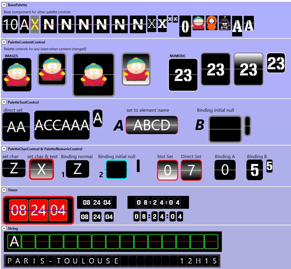
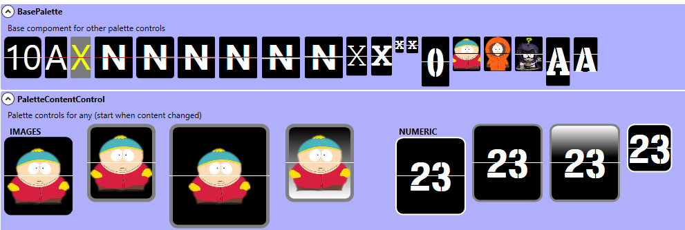
PaletteControl is control to show Numeric, Letter, Word(s), Image, Time, stringg and array of string like train panel indicators in station |
it’s a package contains many control for show this and it s full customizable
you can find
| Control | Descriptions | Animated |
|---|---|---|
| BasePaleteControl | Base control (has no animation) | No |
| PaletteContentControl | Control for show somes content, and run animation when it change | Yes |
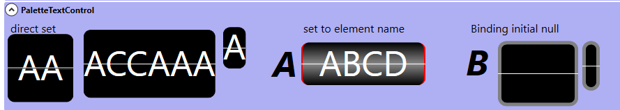
| PaletteTextControl | for animating text | Yes |
| PaletteCharControl | for animating char using allowedChar string | Yes |
| PaletteNumericControl | for animation char number | Yes |
| PaletteTimeControl | for showing current time | Yes |
| PaletteStringControl | for animating one string to other one string | Yes |
| PaletteArrayControl | for animation array of string | Yes |
Properties for all
| Property | Descriptions |
|---|---|
| AdjustTop | allow to move content top |
| CornerRadius | corner radius for control |
| LineColor | define line color at the vertical center of control |
| ShowLine | set if line is visible |
| ContentLine | to replace to common line by control you want (when you use ShowLine = false) |
otherwize you can set properties background, forground, borderbrush, bordertickness to set your content
Properties for animated control
| Property | Descriptions |
|---|---|
| AnimationTime | Define time for release palette animation |
Specific properties
BasePaletteControl & PaletteContentControl
| Property | Descriptions |
|---|---|
| Content | content of control |
PaletteTextControl
| Property | Descriptions |
|---|---|
| Text |
Text for control (multi char) animation start when text change |
PaletteCharControl
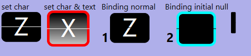
this control animate char from previous char (current) to new setted char with AllowedChar string
For sample : if you have « abcdef » in AllowedChar, this current char is a, and set d, you have an animation a->b, b->c, c->d
| Property | Descriptions |
|---|---|
| char |
Char to set |
| AllowedChar |
string for define allowed char, animation use it |
| CaseSensitive |
if case sensitive if used to find char in AllowedChar |
| Text |
Do not use |
PaletteNumericControl
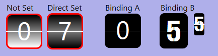
is the same work as PaletteCharControl but AllowedChar is not available and set directly a « 0123456789 »
| Property | Descriptions |
|---|---|
| Value | int value to set |
| Text |
Do not use |
PaletteTimeControl
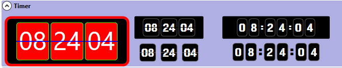
is a control to show current time, you can pause it on using IsPaused (not browsable) dependency property
| Property | Descriptions |
|---|---|
| MarginNumber |
margin between two number in pixel |
| NumberMode |
mode for show part of time, one char for each number or two number |
| NumericBackground |
background for numeric palette |
| NumericBorderBrush |
border brush for numeric palette |
| NumericBorderThickness |
border thickness for numeric palette |
| NumericCornerRadius |
corner radius for numeric palette |
| NumericHeight |
height for numeric palette |
| NumericWidth |
width for numeric palette |
| ShowSecond | if you want to show second number |
| Separator | Content for separator for hour-minute and minute-second (can’t use binding for separator because the Separator ar dupplicated) |
| SeparatorHour | Content for separator for hour-minute |
| SeparatorSecond | Content for separator for minute-second |
| IsPaused | define if time running |
and event SecondTick raised for each second
the common properties background, forground, borderbrush, bordertickness to set all content of this control
PaletteStringControl
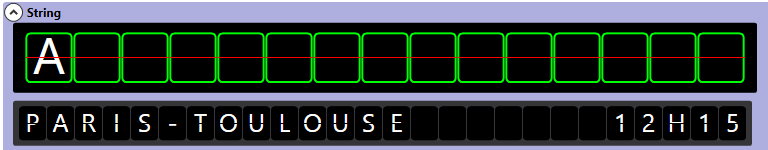
is a control to show string, after define number of char define.
| Property | Descriptions |
|---|---|
| AllowedChar |
same as PaletteTextControl |
| Casesensitive |
same as PaletteTextControl |
| CharBackground |
background for each char palette |
| CharBorderBrush |
border brush for each char palette |
| CharBorderThickness |
border thickness for each char palette |
| CharCornerRadius |
corner radius for each char palette |
| CharCount |
number of char allowed (define number of palette showed) |
| CharHeight |
height for each char palette |
| CharWidth |
width for each char palette |
| CharMargin |
margin between two char |
and event CompletAnim raised when animation is done
the common properties background, forground, borderbrush, bordertickness to set all content of this control
you can change color for each text palette for setting ArrayBrush (dependency property) like this
|
1 2 3 4 5 6 |
List<Brush> list = new List<Brush>(); for (int b = 0; b < 15; b++) { list.Add(Brushes.Yellow); } s00.ArrayBrush = list.ToArray(); |
by default color is white
PaletteArrayControl
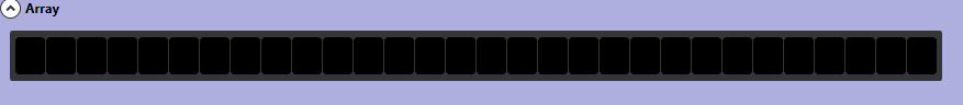
is ths same control as string but using an array of string to set animation to all string in array with pause between two string.
properties are same as PaletteString Control with Pause (dependency property) for setting pause between to string
the common properties background, forground, borderbrush, bordertickness to set all content of this control
you can change color for each text palette for setting ArrayBrush (dependency property) like this
|
1 2 3 4 5 6 |
List<Brush> list = new List<Brush>(); for (int b = 0; b < 15; b++) { list.Add(Brushes.Yellow); } s00.ArrayBrush = list.ToArray(); |
by default color is white
and you can set or clear Array
|
1 2 3 4 5 6 7 8 9 10 11 12 13 14 15 16 17 18 19 20 21 22 |
string[] ar = new string[] { // 1234567890123456 " only for test", " this array control", " possibility", " thanks for", " showing", "" }; // set array private void SetArray(object sender, RoutedEventArgs e) { this.s1.Array = ar; } // clear array private void ClearArray(object sender, RoutedEventArgs e) { this.s1.Array = null; } |
Source code
All this controls are contained in UltimateCorp.Palette.dll and set in xmlns= »http://schemas.microsoft.com/winfx/2006/xaml/presentation »
also you can used directly without specify other namespace
this control are made in .net 6 made with visual studio 2022
you can find test executable PaletteExecutable
and complete project Test Palette v2
Commentaires récents